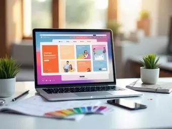

As we approach 2025, the importance of mobile-first design becomes undeniable, with over half of web traffic originating from mobile devices. Businesses that prioritize user experiences on mobile can not only enhance engagement but also improve conversions. Let's explore some key strategies that can shape your approach to mobile design.
What You Will Learn
- Mobile-first UX design is essential for optimizing user engagement and ensuring your site meets the needs of mobile users.
- Implementing core principles such as simplicity, accessibility, and performance optimization can significantly enhance the user experience.
- Prioritizing content design and streamlined interactions can lead to increased retention and usability on mobile devices.
- Utilizing tools like wireframing and prototyping can facilitate the effective implementation of mobile-first design strategies.
Key Mobile-First UX Strategies for 2025
Here’s a visual summary of the core principles and strategies driving mobile-first UX design, ensuring optimal user engagement and performance. To truly understand the impact of these strategies, consider how understanding conversion-focused web design can further amplify your mobile-first efforts.
Core Principles
- Simplicity: Clean, straightforward design.
- Accessibility: Usable by all, including disabled.
- Performance: Fast loading times, efficient resources.
Key Strategies
- Content Prioritization: Visual hierarchy, responsive design.
- Streamlined Interactions: Reduce clutter, progressive disclosure.
- Accessibility Features: Dark mode, text resizing.
- Visual Trends: Neumorphism, glassmorphism.
- Touch-Friendly Nav: Thumb reach, gesture controls.
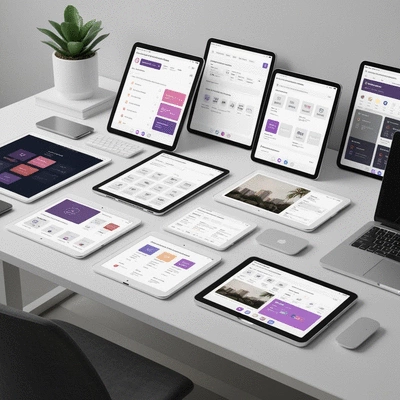
Implementation Tools
- Wireframing: Figma, Sketch.
- Prototyping: InVision, Adobe XD.
- Design Systems: Material Design, Bootstrap.
Community & Resources
- Online Forums: Designer Hangout.
- Thought Leaders: LinkedIn, Twitter.
- Articles: Usability testing, customer feedback.
Understanding Mobile-First UX Design: The Foundation for Engagement in 2025
Mobile-first UX design is an approach that prioritizes the user experience on mobile devices before addressing desktop versions. Why does this matter? As we move into 2025, the significance of mobile-first design is clear: more than half of web traffic comes from mobile sources! It's not just about making websites look good on small screens—it's about creating a seamless and engaging experience that meets users where they are.
At Conversion Catalyst Design, I've seen firsthand how adopting a mobile-first strategy can dramatically improve user engagement. By focusing on mobile design, businesses can better serve their audience, enhance accessibility, and ultimately drive conversions.
What is Mobile-First UX Design and Why It Matters
Mobile-first UX design is rooted in the principle that mobile experiences should be built first and foremost. This approach ensures that websites and apps are not only functional but also optimized for user engagement. With the ever-increasing use of smartphones and tablets, it's crucial to cater to these users. By doing so, businesses can create intuitive experiences that foster loyalty and trust.
- Higher Engagement Rates: Mobile-first design leads to better interaction, keeping users on your site longer.
- Improved SEO Performance: Google prioritizes mobile-friendly sites, boosting visibility and traffic.
- Increased Conversion Rates: A well-designed mobile interface can significantly enhance sales and lead generation.

In my experience, investing in mobile-first design not only addresses user needs but also positions businesses for long-term success in the digital landscape of 2025. It also plays a crucial role in behavioral analytics that enhances user experience by providing valuable insights into mobile user interactions.
Core Principles of Mobile-First Design
When considering mobile-first design, there are several core principles that guide the process. These principles include simplicity, accessibility, and performance optimization. Let's dive into each of these elements:
- Simplicity: A clean and straightforward design is essential. Users should easily navigate your site without distractions.
- Accessibility: Ensuring that all users, including those with disabilities, can interact with your site is vital. This includes text readability and functional design.
- Performance Optimization: Fast loading times and efficient resource management keep users engaged and reduce bounce rates.
By adhering to these principles, you can create a mobile experience that not only looks appealing but functions effectively across various devices. As experts in mobile-first design at Conversion Catalyst Design, we integrate these core principles to ensure our client's websites are both beautiful and functional.
Engage with Your Audience
As you implement mobile-first design strategies, consider how user feedback can shape your approach. Have you ever asked your users directly about their experiences? Gathering input through surveys or feedback forms can provide invaluable insights that inform design improvements. What changes would your audience like to see on your mobile site? Engaging with your users not only enhances their experience but also builds a community around your brand.
Summarizing Key Mobile-First UX Strategies for 2025
As we approach 2025, it’s clear that adopting mobile-first practices is no longer just an option; it’s essential for success. Throughout this article, we’ve explored various aspects of mobile-first UX design, from its core principles to best practices for enhancing user engagement. By prioritizing mobile experiences, we ensure users have a seamless and satisfying journey on any device.
Let’s recap some of the main strategies that can significantly impact your approach:
- Content Prioritization: Focus on visual hierarchy and responsive design.
- Streamlined Interactions: Reduce clutter and employ progressive disclosure.
- Accessibility Features: Implement dark mode, text resizing, and compliance with standards.
- Visual Trends: Leverage neumorphism, glassmorphism, and micro-interactions.
- Touch-Friendly Navigation: Design with thumb reach and gesture controls in mind.
By implementing these strategies, businesses can significantly improve their user engagement and ensure that their mobile interfaces are not only functional but also delightful.
Next Steps for Implementing Mobile-First Design with Design Systems
Now that you have a solid understanding of mobile-first design, what’s next? I encourage you to dive deeper into actionable checklists and tools that can facilitate your implementation. Here are some resources to consider:
- Wireframing Tools: Use platforms like Figma or Sketch to create initial layouts.
- Prototyping Resources: Explore InVision or Adobe XD for interactive prototypes.
- Design Systems: Check out Material Design or Bootstrap for ready-made components.
By utilizing these resources, you can apply the strategies discussed in this article effectively and create a mobile-first design that resonates with your audience. For further insights into technical performance, consider exploring web performance tools for 2025 to optimize your mobile sites.
Engaging with the Community and Resources on User-Centered Design
Finally, I invite you to join the conversation around mobile-first UX design! Share your experiences and insights with others who are passionate about user-centered design. Engaging with the community can provide valuable perspectives and foster collaboration. Here are a few ways you can participate:
- Join Online Forums: Participate in discussions on platforms like Designer Hangout or UX Stack Exchange.
- Follow Thought Leaders: Connect with industry experts on LinkedIn or Twitter for the latest trends.
- Read and Share Articles: Explore blogs and resources that focus on usability testing and customer feedback.
By actively engaging with others, you not only enhance your knowledge but also contribute to a growing field that prioritizes effective user experiences. Let’s work together to create designs that truly make an impact!
Frequently Asked Questions About Mobile-First UX Design
Q: What is mobile-first UX design?
A: Mobile-first UX design is an approach where the design process begins with creating the user experience for mobile devices, then scaling up to larger screens like desktops. This ensures optimal functionality and engagement for the majority of web traffic.
Q: Why is mobile-first design important for businesses in 2025?
A: With over half of all web traffic originating from mobile devices, prioritizing mobile-first design is crucial for enhancing user engagement, improving SEO performance (as Google prioritizes mobile-friendly sites), and increasing conversion rates.
Q: What are the core principles of effective mobile-first design?
A: The core principles include simplicity (clean, straightforward design), accessibility (usable by all, including those with disabilities), and performance optimization (fast loading times and efficient resource management).
Q: What are some key strategies for mobile-first UX design?
A: Key strategies involve content prioritization (visual hierarchy, responsive design), streamlined interactions (reduced clutter, progressive disclosure), accessibility features (dark mode, text resizing), leveraging visual trends (neumorphism, glassmorphism), and touch-friendly navigation (thumb reach, gesture controls).
Q: What tools can help implement mobile-first design?
A: Useful tools include wireframing platforms like Figma and Sketch, prototyping resources such as InVision and Adobe XD, and design systems like Material Design and Bootstrap for ready-made components.
Recap of Key Points
Here is a quick recap of the important points discussed in the article:
- Prioritize Mobile Experiences: Mobile-first UX design should be the foundation of your strategy to enhance user engagement.
- Adhere to Core Principles: Focus on simplicity, accessibility, and performance optimization to create effective mobile experiences.
- Implement Best Practices: Utilize content prioritization, streamlined interactions, and accessibility features to improve user satisfaction.
- Leverage Visual Trends: Incorporate modern design elements like neumorphism and micro-interactions for a fresh look.
- Utilize Resources: Take advantage of tools like Figma, InVision, and established design systems to streamline the design process.