What if you could visually map out your users' behaviors to optimize your website for better conversions? Heatmaps provide a unique perspective on user interactions, empowering web designers to make data-driven decisions that enhance user experience.
What You Will Learn
- Understanding the different types of heatmaps: click, scroll, and attention heatmaps, and their specific applications in web design.
- How to effectively interpret heatmap data to identify user engagement patterns and drop-off points.
- The importance of making informed design decisions based on user behavior data to improve conversion rates.
- Real-world examples of successful heatmap applications that led to significant increases in user engagement and conversions.
Heatmap Types and Applications for Conversion Rate Optimization
Heatmaps offer invaluable insights into user behavior, enabling data-driven design decisions. Below is a comparison of the three primary heatmap types and their key applications, helping optimize websites for better performance and conversions. For a deeper understanding of how these insights enhance user experience, consider exploring behavioral analytics and its role in improving user experience.
Click Heatmaps
Show where users click on a page.
*Identify engaging elements & overlooked content.
Scroll Maps
Analyze how far users scroll down content.
*Reveal content engagement levels & drop-off points.
Attention Heatmaps
Illustrate where users focus their attention.
*Optimize layout, typography & visual hierarchy.
Overall Goal
Enhance user experience & drive conversions.
*Data-driven insights for strategic web design.
Understanding Heatmaps and Their Role in Conversion Rate Optimization
In the world of web design, understanding heatmaps can be a game changer for improving conversion rates. These powerful tools provide visual representations of user interactions on your website, allowing you to see exactly how visitors engage with your content. Heatmaps transform complex data into easy-to-understand visuals, making it simpler for us at Conversion Catalyst Design to optimize our clients’ sites for better performance.
As a seasoned web designer, I've seen firsthand how insights derived from heatmap data can significantly enhance user experiences and drive conversions. By analyzing where users click, scroll, and focus their attention, you can create more engaging and effective web pages that resonate with your audience.
What Are Heatmaps? Types and Uses Explained
Heatmaps come in various types, each serving a unique purpose to help us understand user behavior better. Here’s a breakdown of the key types of heatmaps and how they can be utilized: For more details on improving user experience with heatmaps, see our article on improving UX with heatmaps and replays.
- Click Heatmaps: These show where users are clicking on your page, helping identify which elements capture attention.
- Scroll Maps: They analyze how far users scroll down your content, revealing engagement levels across your website.
- Attention Heatmaps: These illustrate where users focus their attention, highlighting areas that attract or repel interest.
By leveraging these insights, we can make informed design choices that enhance user engagement and lead to higher conversion rates. Understanding the distinctions between these types of heatmaps allows us to tailor our strategies to meet specific business goals.
Click Heatmaps: Where Users Are Clicking on Your Page
Click heatmaps are incredibly valuable in identifying which elements on your website grab attention. They display a color-graded map of clicks, with warmer colors indicating more clicks. This data allows us to determine if users are engaging with call-to-action buttons or if important content is being overlooked.
For instance, if we notice a lot of clicks on an image that isn’t a link, we might consider making that image a clickable element. This simple adjustment can significantly improve user navigation and conversion rates!
Scroll Maps: Analyzing User Engagement Throughout Your Content
Scroll maps provide insights into how far down the page users are scrolling. This data is crucial for understanding whether visitors are engaging with your content or dropping off before they reach key information. If we see a significant drop-off point, it might indicate that the content above that point is too long or unengaging.
By adjusting the layout or breaking content into smaller sections, we can enhance the scrolling experience and encourage users to explore more of your site!
Attention Heatmaps: Understanding Where Users Focus
Attention heatmaps offer another layer of insight by highlighting where users are most focused on your page. This information can help us optimize layout, typography, and visual elements to direct user attention effectively. If we discover that certain areas are being ignored, we might rethink the design to ensure essential calls to action are more prominent.
Creating visually appealing, user-centered designs depends on understanding these focus areas. It’s about making sure your key messages and CTAs don’t get lost in the shuffle!
Exploring Different Heatmap Types and Their Applications
In summary, each heatmap type offers unique insights that can dramatically improve your website’s performance. By integrating click, scroll, and attention heatmaps into our analysis, we can create data-driven strategies that cater specifically to user behavior. This approach not only enhances user experience but also fosters greater engagement and conversion rates.
At Conversion Catalyst Design, we are committed to utilizing these insights to empower your business with exceptional web designs that prioritize user experience and drive conversions. Let's dive deeper into how to interpret heatmap data effectively!
Interpreting Heatmap Data: Key Insights into User Behavior
Understanding heatmap data is just as crucial as collecting it. It’s essential to know how to read these visualizations effectively to derive actionable insights. Here are some key points to consider:
- Visual Clarity: Ensure the heatmap visualization is clear and easy to interpret.
- Click Density: Pay attention to areas with high click density, as they indicate user interest.
- Drop-off Points: Identify where users tend to stop scrolling or leave the page.
By paying close attention to these factors, we can extract meaningful insights that directly inform our design and optimization strategies.
How to Read Heatmap Visualizations Effectively
Reading heatmap visualizations effectively requires a keen eye for detail. Start by looking at the color gradients—warm colors typically indicate higher engagement, while cooler tones may signify areas that need attention. This simple breakdown helps prioritize areas for design improvements.
For example, if a call-to-action button is in a cooler area, it may not be visible enough or appealing enough for users to click. Adjustments in placement, size, or color can help draw more attention to it!

Identifying Trends and Patterns in User Interactions
Another critical component of interpreting heatmap data is identifying trends and patterns in user interactions. Are users consistently ignoring certain sections or gravitating towards specific features? By analyzing this behavior, we can make informed decisions on how to enhance the overall user experience.
Spotting these trends allows us to pivot our strategies. For instance, if users are frequently clicking on a particular image, we might consider developing a corresponding promotional banner linked to that image to capitalize on user interest!
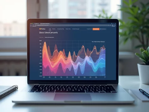
Utilizing Data Visualization Techniques for Enhanced Analysis
Data visualization techniques can amplify our understanding of heatmap data. Using tools like graphs and charts alongside heatmaps can help clarify patterns and trends over time. By combining these various visualization methods, we can create a comprehensive analysis that drives effective design decisions.
Ultimately, the more we understand user behavior, the better we can cater to their needs, ensuring your website not only attracts visitors but converts them into loyal customers!
Engagement Opportunity: Share Your Heatmap Success Stories
Have you implemented heatmaps in your web design strategy? We’d love to hear your experiences! What insights did you gain, and how did they impact your conversion rates? Sharing your stories can inspire others in the community to leverage this powerful tool. Join the conversation below!
Frequently Asked Questions About Heatmaps
What are heatmaps and how do they help with conversion rate optimization (CRO)?
Heatmaps are visual representations of user interactions on a website, showing where users click, scroll, and focus their attention. They help with CRO by providing data-driven insights into user behavior, allowing designers to make informed decisions to improve website usability and engagement, ultimately leading to higher conversion rates.
What are the main types of heatmaps and what do they reveal?
The main types are Click Heatmaps, Scroll Maps, and Attention Heatmaps. Click Heatmaps show where users click, identifying engaging elements. Scroll Maps reveal how far users scroll, indicating content engagement and drop-off points. Attention Heatmaps illustrate where users focus their gaze, helping optimize layout and visual hierarchy.
How do I interpret heatmap data effectively?
Effective interpretation involves looking at visual clarity, click density (warmer colors indicate more engagement), and identifying drop-off points. Analyzing trends and patterns in user interactions and using data visualization techniques like graphs can further enhance understanding.
Can heatmaps directly impact conversion rates?
Yes, heatmaps can significantly impact conversion rates. By understanding user behavior, designers can optimize calls-to-action, improve content placement, and refine overall website layout, leading to enhanced user engagement and increased conversions. Real-world examples show substantial increases in clicks, form submissions, and ad engagement after implementing heatmap-driven changes.
What are the first steps to implementing heatmaps on my website?
To get started, choose a heatmap tool (e.g., Hotjar, Crazy Egg), set up tracking by integrating the tool into your website, and regularly analyze the collected data to spot trends and areas for improvement. You can also combine heatmap data with online surveys for a more comprehensive understanding of user needs.
Recap of Heatmaps' Power in Conversion Rate Optimization
As we wrap up our discussion on heatmaps, it's clear that these tools hold remarkable potential in enhancing conversion rate optimization (CRO). By visualizing user behavior, heatmaps provide invaluable insights that can transform the way we design and optimize our websites. Let's explore the myriad benefits they offer and how they can drive significant results for your business!
Summarizing the Benefits of Using Heatmaps for CRO
- Enhanced User Engagement: Heatmaps allow you to see exactly where users are clicking, which can guide you in making your content more engaging.
- Informed Design Decisions: With a clear view of user behavior, you can tailor your website layout to better meet visitor needs.
- Data-Driven Optimization: Instead of guessing what works, you can rely on tangible data to inform your changes.
Utilizing heatmaps not only improves user experience but also contributes directly to conversions. For instance, a well-placed call-to-action button on your site can lead to a noticeable increase in user engagement. Remember, it’s all about making informed design choices that resonate with your audience!
How Heatmaps Contribute to Enhanced User Engagement and Conversions
Heatmaps shine a light on user interactions by showing where attention is focused on your site. This insight allows us to enhance our web design and prioritize elements that attract clicks. For example, if you notice users frequently clicking on a specific image, it might be worth turning that image into an actionable link!
Moreover, by tracking how far users scroll, I can refine content placement to ensure that critical information and CTAs are positioned for maximum visibility, ultimately leading to better conversions.
Real-world Examples of Successful Heatmap Applications
- E-commerce Success: An e-commerce site used heatmaps to discover their discount banners were being ignored. After repositioning them, they saw a 30% increase in clicks!
- Service-Based Websites: A service provider optimized their landing page by shifting the CTA based on heatmap insights, resulting in a 25% boost in form submissions.
- Blog Engagement: A blog analyzed reading patterns and found that readers were dropping off before reaching sponsored links. By restructuring the layout, they increased ad engagement by 15%.
These examples illustrate just how impactful heatmaps can be when applied thoughtfully. It's about making small tweaks that lead to substantial gains!
Evaluating ROI Through Effective Heatmap Usage
When we talk about ROI, it’s crucial to remember that the insights drawn from heatmaps can lead to significant financial benefits. By improving user engagement and conversions, you’re not just enhancing the look of your website; you're also investing in its performance. Tracking metrics before and after implementing these changes will reveal the true value of your heatmap insights. For a broader understanding of how design principles contribute to e-commerce success, consider reading about design principles for e-commerce success.
As a business owner, I’ve seen firsthand how converting visitors into loyal customers can be achieved by understanding their behavior. It’s a journey worth embarking on, and heatmaps can be your guiding star!
Encouraging Action: Start Using Heatmaps to Drive Conversion Improvements
It’s time to take action! If you haven’t yet incorporated heatmaps into your strategy, now is the perfect moment to start. By understanding your users better, you can create a more personalized experience that drives conversions.
Taking the First Steps: Implementing Heatmaps on Your Website
Implementing heatmaps is simpler than you might think! Here are a few steps to get you started:
- Choose a Heatmap Tool: Select a tool that fits your business needs, such as Hotjar or Crazy Egg.
- Set Up Tracking: Integrate the tool into your website to start collecting data.
- Analyze Data: Regularly review your heatmap data to spot trends and areas for improvement.
Taking these initial steps can lead to profound insights about your users’ behaviors and preferences, empowering you to make better design decisions.
Contacting Experts for Custom Heatmap Solutions and Strategies
If you're feeling overwhelmed by where to start, don't hesitate to reach out for help! At Conversion Catalyst Design, we're dedicated to helping businesses like yours harness the power of data-driven design. I'd love to chat about how we can create tailored heatmap strategies that meet your specific objectives.
Engagement Opportunity: Share Your Heatmap Success Stories
I’m always eager to hear how others are leveraging heatmap insights! Feel free to share your experiences and how they’ve impacted your business. Engaging with fellow business owners can spark new ideas and approaches!
Utilizing Online Surveys for Continuous User Insights
Finally, don't underestimate the value of direct feedback! Pairing heatmap data with online surveys can provide a holistic view of user needs. Understanding not just where users click, but also why they make those choices can lead to a deeper understanding of your audience.
Let’s make the most of these insights together and drive those conversions up! Happy optimizing!
Recap of Key Points
Here is a quick recap of the important points discussed in the article:
- Understanding Heatmaps: Heatmaps visually represent user interactions, such as clicks and scrolls, to enhance website performance.
- Types of Heatmaps: Key types include Click Heatmaps, Scroll Maps, and Attention Heatmaps, each offering unique insights into user behavior.
- Data Interpretation: Focus on visual clarity, click density, and drop-off points to extract meaningful insights from heatmap data.
- Design Decisions: Utilize heatmap insights to inform design choices, optimize layouts, and improve user engagement.
- Action Steps: Start using heatmaps by selecting a tool, setting up tracking, and analyzing data regularly for continuous improvement.